THE BRIEF
Ensure a safe and secure train travelling experience for passengers by providing accessible, comprehensive safety information and safety features within the Trainline platform.
But first
What is Trainline?
Trainline is an international digital rail and coach technology platform headquartered in London, UK. It helps passengers check travel times and purchase tickets seamlessly across different railway and coach services for over 270 operators in 40 countries, all in one platform.
Making journeys safer
My team and I created a flow that helped lone women travellers prepare for and subsequently have safe train-travel experiences via the Trainline app. Based on insights derived from our primary and secondary research, we created app features for our user including:
- A panic button on their phone or smartwatch to call for help in an emergency
- Seeing how busy different train coaches are so they can make an informed decision on where to sit
- Sharing your live location with a loved one
The flow was created as a Figma prototype for an iPhone 14 and was tested with real users. We successfully scored a 4 out of 5 from our testing participants.
The resulting solution and testing results were presented to our clients along with improvement suggestions for areas with usability issues that had been identified during testing. We were praised for our process rigour and thoughtfulness in different use cases. The technical feasibility of the designs were also applauded for our consideration of technical constraints thus showing thoughtfulness regarding design feasibility in development.
Duration
Apr – May 2023
(6 weeks)
grade attained
High Distinction
This was the industry project for my MA in User Experience and Service Design at Loughborough University (2022-23).
My Role
Lead UI/UX Designer
Out of a team of 5 designers
Responsibilities
As the Lead UI/UX Designer, I dictated the overall UX process we followed and delegated tasks to various team members.
- Ideation facilitation
- Leading User Interface (UI) Design and prototyping
- Project management
Click here to jump to designs >

Dissecting the brief
Ensure a safe and secure train travelling experience for passengers by providing accessible, comprehensive safety information and safety features within the Trainline platform.
Equipped with the brief, we sought clarification on the constraints of the project. We found that we were free to find our own direction based on research findings and subsequently had full freedom to pursue whatever design process we felt was appropriate to reach the outcome. The solution had to consider the fact that Trainline does not have control of train or bus stations or the modes of transport themselves. Most importantly, the solution needed to be executed on the Trainline app and website as the company possessed its own platform.
Researching the problem space
With our given timeframe of 6 weeks, we chose to adopt a mixed methods lean research process to get a quick sense of who our users are and the issue from different angles.
Secondary Research

Provided an overview of the current state of safety in the UK transport system. This gave us an idea of different kinds of harassment that happen areas for further investigation.
Primary Research

We then followed up with a mixture of primary research methods (shown below) to get a clearer picture of our user and their challenges.
Guerilla Research
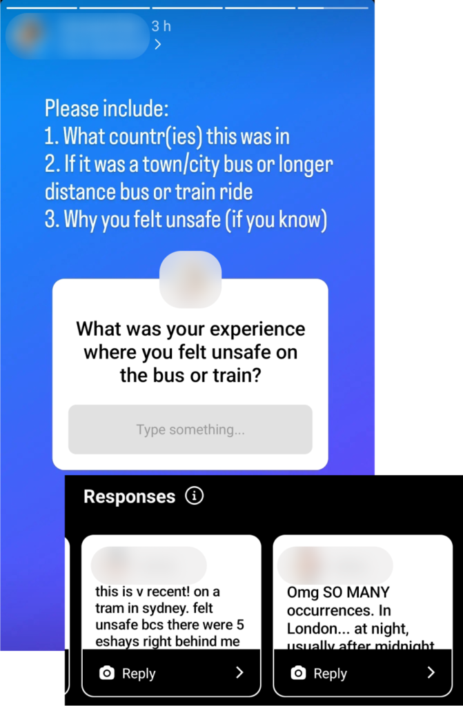
We created Instagram stories that the team shared on their personal accounts calling for people to share their safety experiences. This gave us an idea of different types of issues passengers faced. We spoke to some individuals for more details.
User Interviews
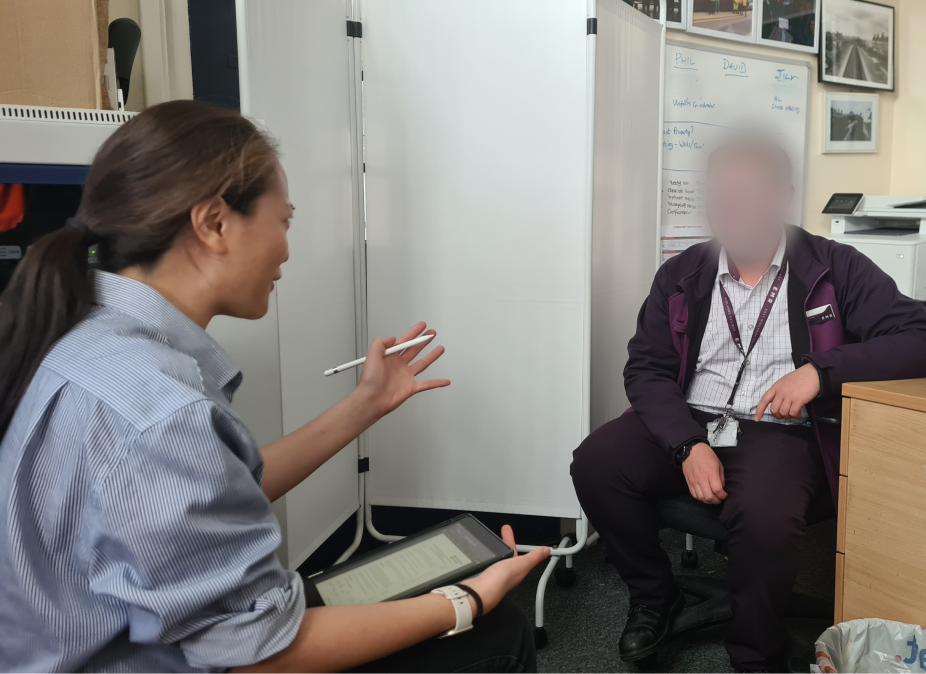
We conducted interviews with train station staff to understand understanding the role of train staff when there is a safety incident at a train station or on the train.
Autoethnography
A teammate went on an auto-ethnography trip from Loughborough to London to experience the in-train journey from the perspective of a safety-focused passenger.

Research insights
Lone women travellers are targets for harassment
Our research revealed that lone women travellers are often targets for harassment, especially minoritised women. The majority of our respondents were women and the harassment they faced ranged from being stared at sexually to more physical actions like non-consensual touching and even groping. This was consistent with news reports and academic studies.
Women especially perceive certain situations as unsafe
Women by and large find more situations unsafe even though they might not be in any danger. Their sense of discomfort grows when it is night time and they are on quiet train stations and platforms, in enclosed spaces such as train coaches or if there is a larger group of men who may be rowdy or drunk.
Lack of visible safety measures contributes to feelings of unease
There are often safety measures such as train staff on the train and in the train station as well as safety points and CCTV but their presence is not always clear. This therefore makes passengers unsure of what to do if they feel unsafe.
Identifying an area of focus
Defining the user persona
We first came up with the user persona of Anika based on our research findings to create a shared understanding of the user within the team and with the clients. It also gave us a persona we could empathise with and continuously refer to throughout the design process to consider how Anika would think and feel at different points in the journey.
It is important to note that while our user is a minoritised woman, the solution we designed is applicable to a broader group of users beyond this demographic.

Mapping the current experience
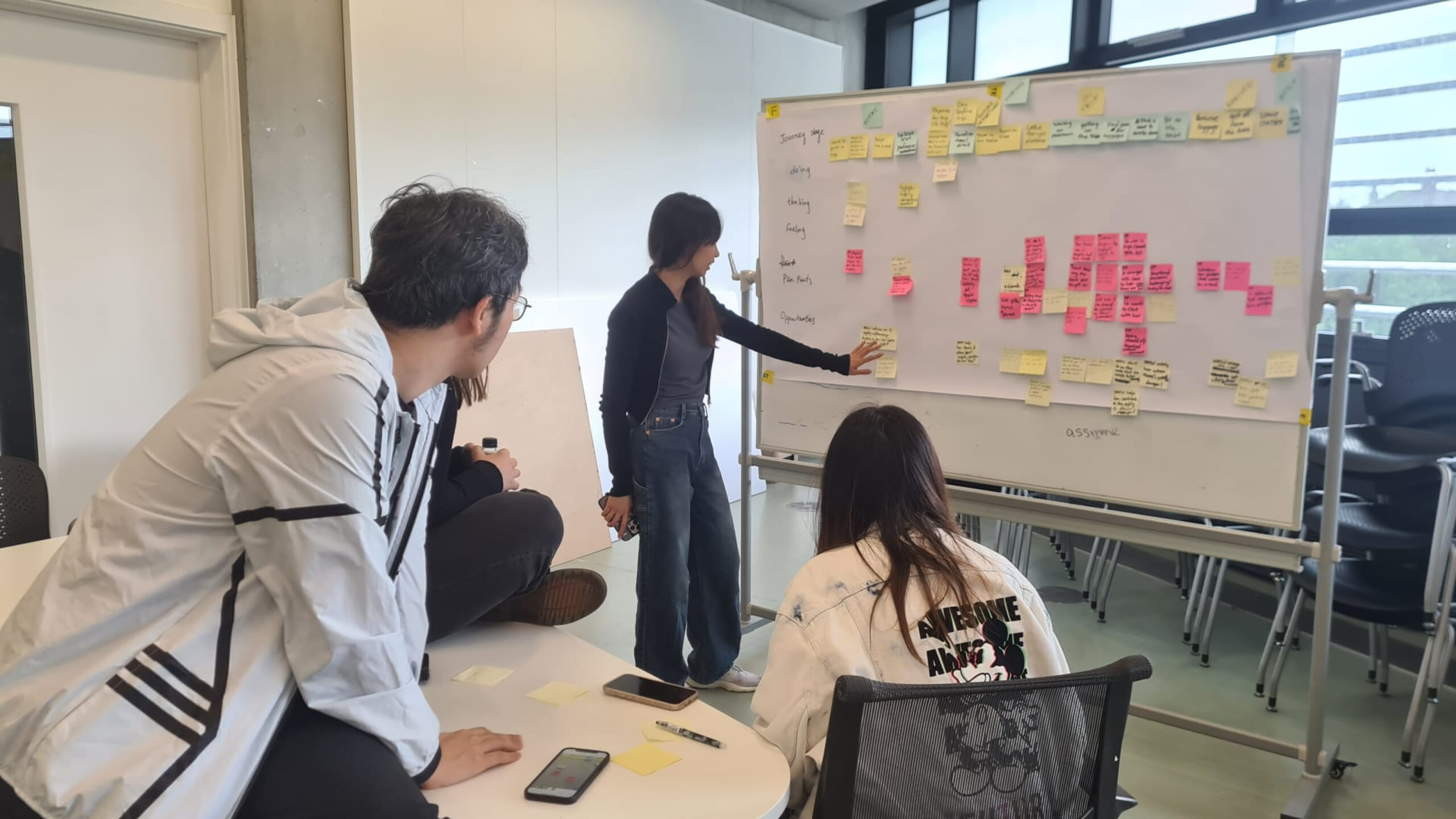
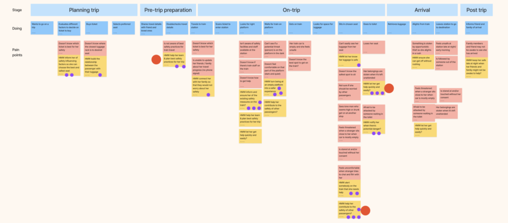
Next, we collaboratively mapped the current train travel experience. From the time that our user booked a ticket to the time that she arrived at her destination, we highlighted key steps, touchpoints and as many pain points (shown in dark pink) in the existing user’s journey based on what we had learnt from our research. This gave us a comprehensive view of the challenges Anika faced and also helped us identify which areas were crucial to address as they might have a knock-on effect to the rest of her experience. This ensured that we remained user-centred and that the challenges were contextualised so that we could create an ultimately appropriate solution.
Choosing the right opportunities
We then flipped the pain points into ‘How Might We’ questions that reframed the challenge into a desired outcome thus shifting us from a problem to a solution space. This method didn’t prescribe a specific method achieve the outcome but provided an end state that clearly identifies what kind of value we want to create for the user. This allowed us to stay flexible, think creatively, and to later choose the most appropriate solution from the ideation phase.
We voted for HMWs that addressed our user’s needs and offered the greatest value to them as well as Trainline. The votes by teammates are indicated by the purple dots (below) whereas the red dots show the decider’s (my co-lead’s) 3 final choices. The decider voted considering whether the HMWs we selected would have sufficient impact on the user and our potential workload vs. capacity. This helped us stay focused on a handful of problems we could address rather than trying to solve too many issues and spreading ourselves too thin.
Chosen opportunities
We chose to focus on 3 HMWs:
- HMW help our user learn best safety practices for her trip so she can be prepared?
- HMW let our user get help quickly and easily?
- HMW help our user contribute to the safety of other passengers?
Devising a solution
In response to the challenges we would be tackling, we decided on 3 guiding principles for how our solution would feel to our user:
- Empowering – Our user would be equipped to make informed decisions in her journey.
- Reassuring – The solution would give our user ways to prepare and have peace of mind.
- Responsive to each user’s needs – The solution must adapt to each user’s needs appropriately based on the stage of the journey they’re in.

Solution sketching
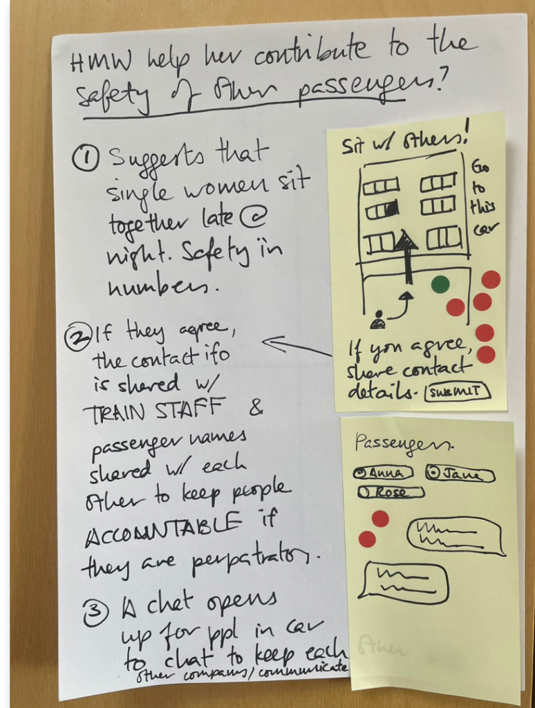
We assigned individual teammates to one chosen HMW each. They then had find real world potential solutions for them to serve as inspiration for the solutioning phase. Taking our cue from the Google Design Sprint format, I facilitated a 1 hour timed solution sketching session where every teammate sketched a complete solution for each HMW. The solutions were stuck up on the wall and reviewed by the team in silence.
The best solutions were then voted on by the teammates and and supervoted by my team co-lead. These solutions were then evaluated against our design principles and became large parts of our final solution.
Journey and wireframes
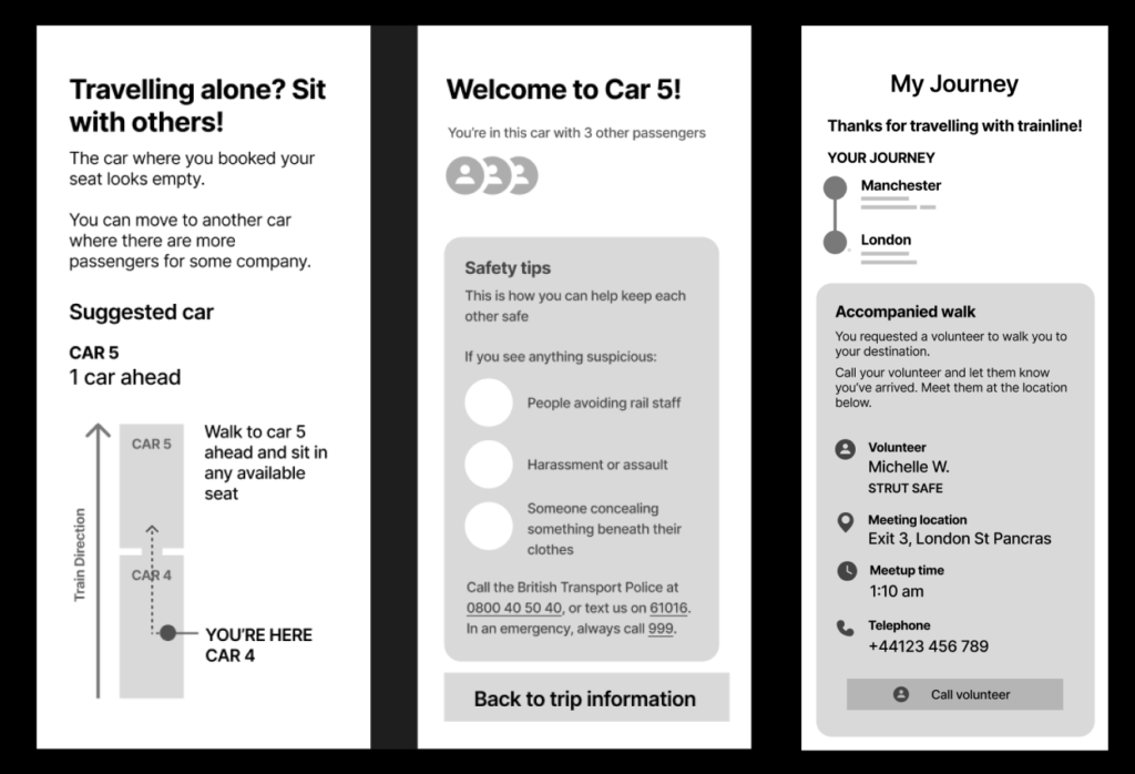
We created a high-level flow that described a realistic journey that starts when when our user buys a tickets through the app, travels by train to London late at night and ends when Anika arrives at her final destination. This created the scenario that we ultimately tested and showed us the total number of screens we had to design. We filled key sections of our prototype with the supervoted solutions and wireframed all the screens.
These wireframes helped us think about the content organisation and get quick feedback from the client before creating a high-fidelity prototype thus reducing the amount of reworking required.
The final solution ✨
The solution was prototyped in Figma. I served as the lead designer, adapting the design from Trainline’s existing design system and laying out design conventions (spacing, text size, design elements like buttons and cards etc.) that another designer used when creating subsequent screens. Here, I came up with the layout and copy for each screen and supervised the other designer’s work. Here are some key features that we prototyped and tested:
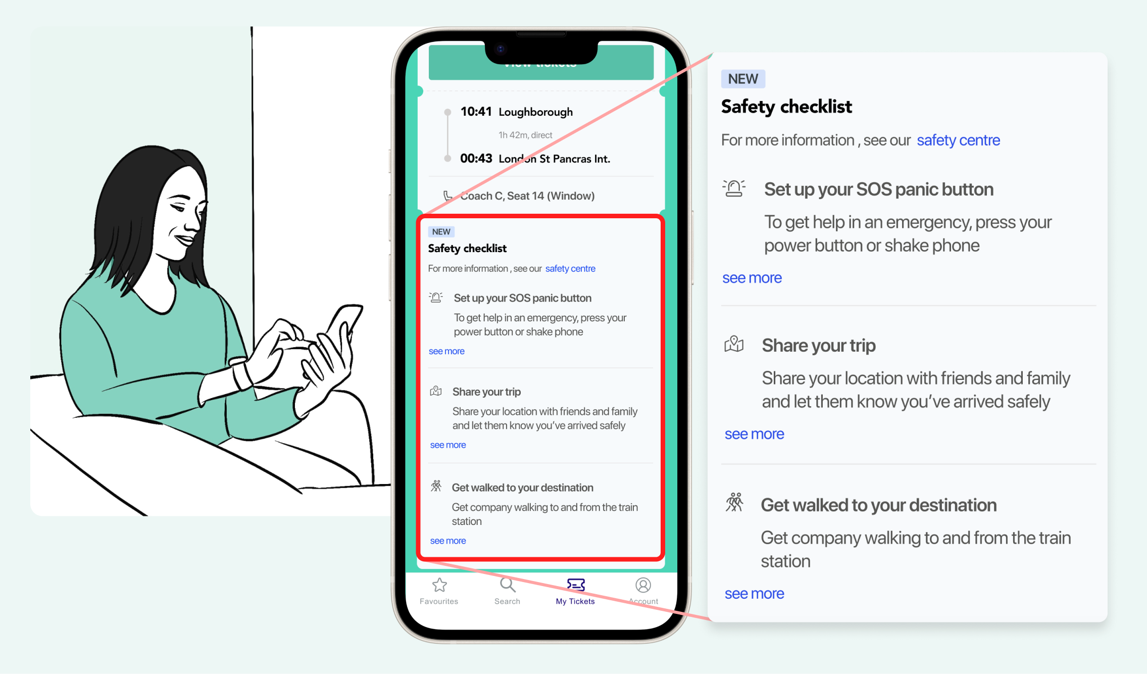
Safety checklist
After buying the tickets but before starting her trip, there is a safety checklist where our user, Anika, can set up safety features.
This includes setting up a panic button that she can use in emergencies to call for train staff on the train. She can choose how she wants to activate it, for example by shaking her phone or pressing her smartwatch side button.
Anika can also share her trip with her loved ones. She can add her estimated time of arrival, and the app will notify her safety contacts if she doesn’t confirm her safe arrival.
Lastly, she can apply to have a volunteer from a trusted organisation walk her to or from the station.
These features will help Anika learn and plan best safety practices for her trip.

Coach switch
When Anika is on the platform, she gets a notification which highlights the option to change her coach. If she is travelling alone at night, the app suggests a coach with more people in it, but gives visibility of roughly how many people are in other nearby coaches. This enables the user to make an informed choice that is most comfortable for her, whether that is to stay in a quieter coach or to sit with more people.
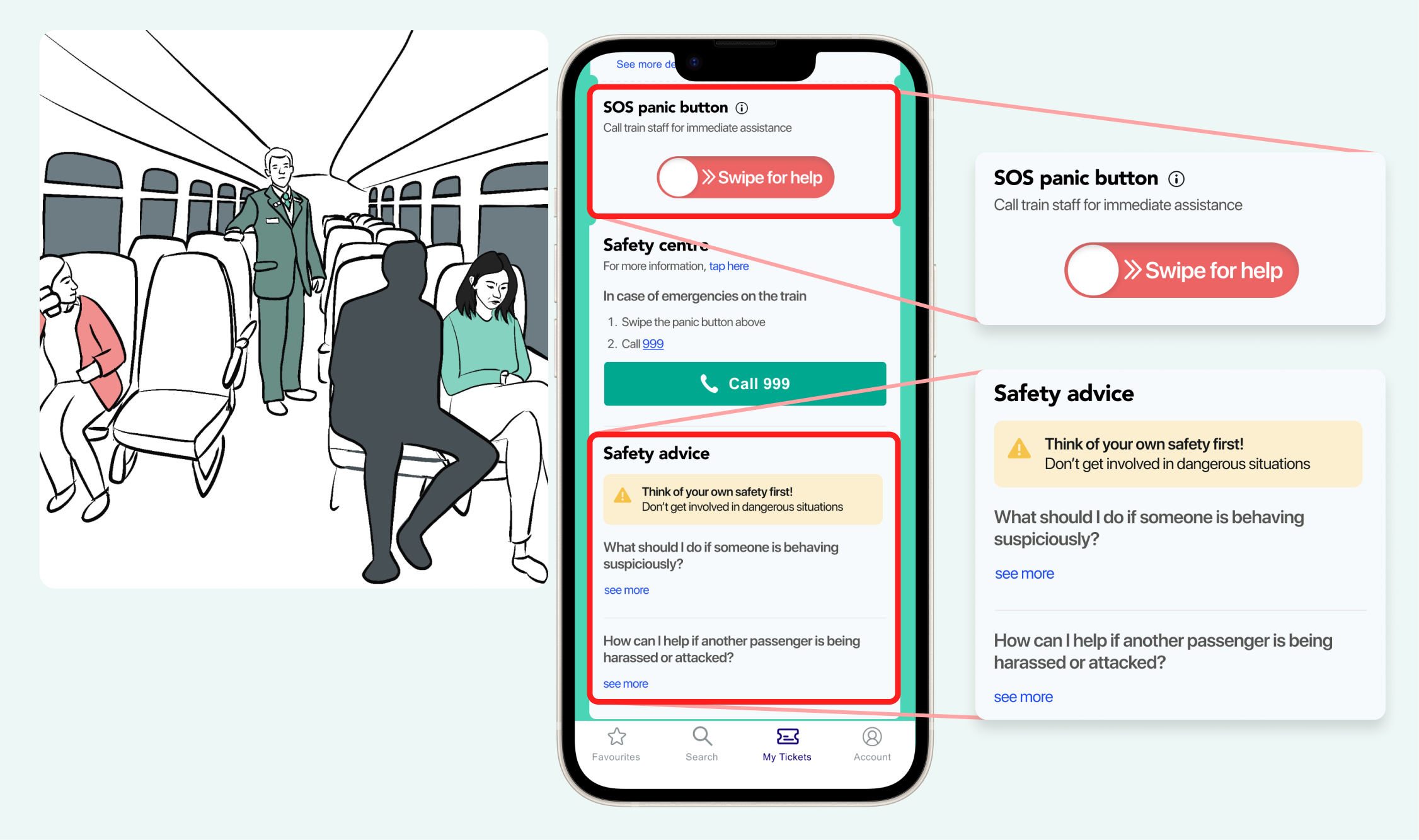
Panic button
While Anika is on the train, someone sits next to her and begins harassing her. In a situation like this, Anika could use the panic button to call for train staff to come help her. This can also be activated using other means that she had set up, including her smartwatch side button.
The app also gives safety advice about what to do in a situation where someone else is harassed or attacked. This enables passengers to know what to do to help keep other passengers safe.
Accompanied walk
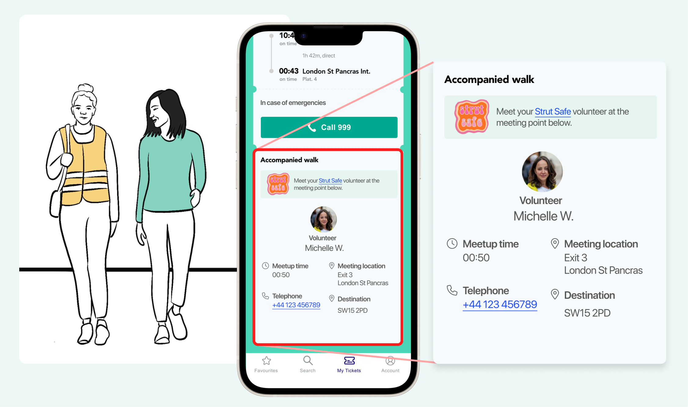
Anika has applied for an accompanied walk with an accredited local women’s safety organisation prior to embarking on her trip. Before she arrives at her destination, she receives a confirmation with a name, a picture of the volunteer, and her telephone number. Once she gets off her train, she meets up with volunteer, and they walk to her destination.
Testing
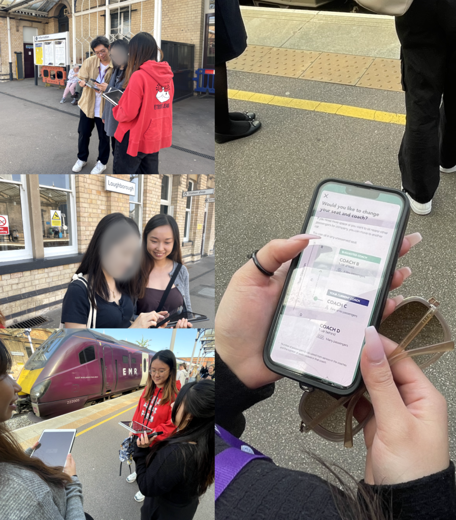
We tested the prototype at the Loughborough train station with three participants using a Figma high-fidelity prototype. The objective was to understand user’s perception of the design and to assess feature usefulness and usability. These would let us know what parts of the solution needed to be improved.
We tested the pre-trip booking information, the safety checklist, changing coach, and the post trip volunteer accompanied walk.
Results

Users said that the solution created a sense of security and a seamless on-trip flow. The main drawback was that the safety checklist was not ideally placed in the flow after ticket purchase and could be easily missed.
Share your trip: 4.7/5
The feature that received the most positive feedback was the ‘Share your trip feature,’ as it effectively reminded users to let their families know that they had arrived safely.
Coach switching: 4.3/5
This helped them make a more informed decision on where to sit.
SOS Panic button: 4.3/5
Seen as a fast and effective way to get help for others or themselves during emergencies.
The functions are easy to use and I think they are novel methods to increase the feeling of safety.
Participant 2
Areas for improvement
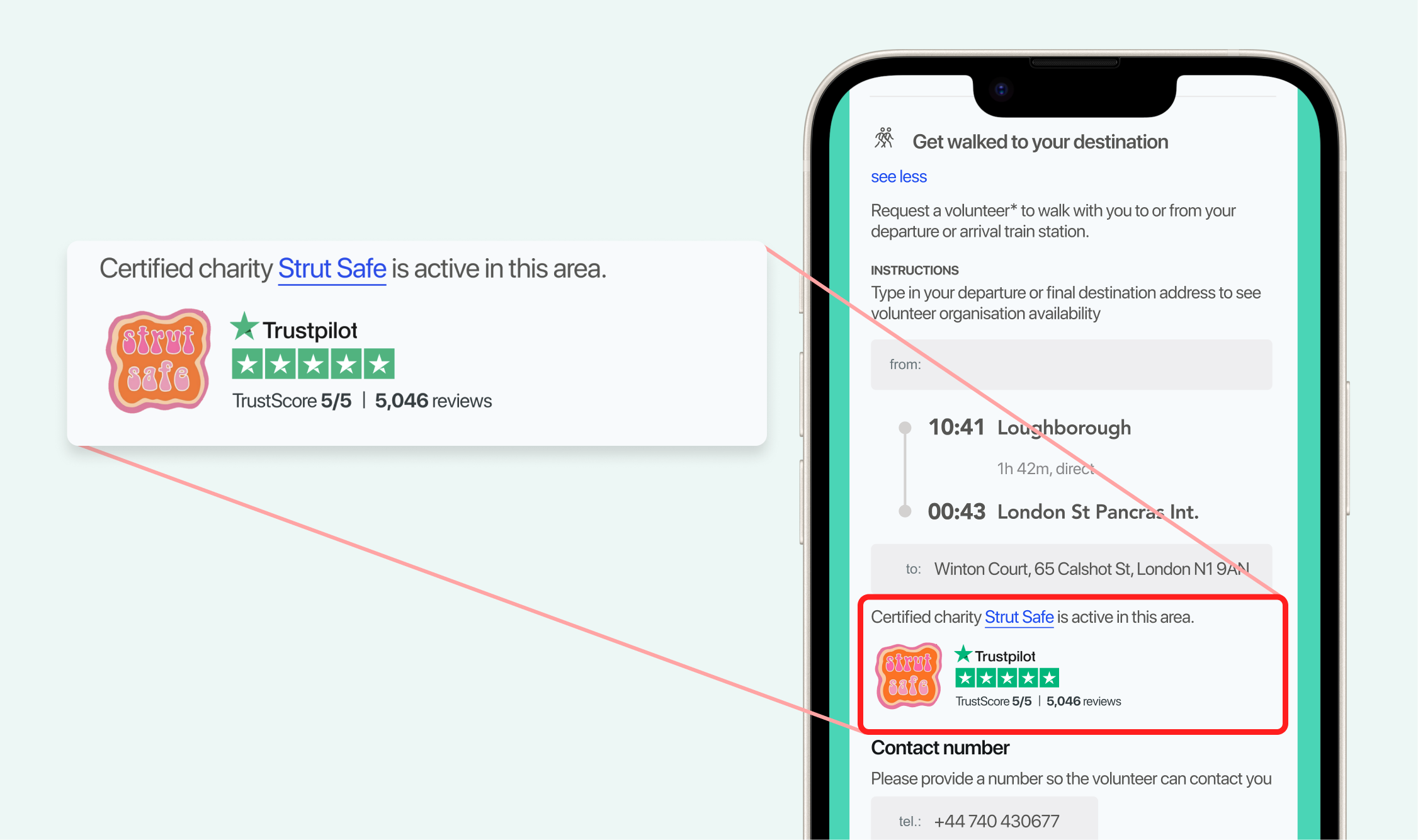
Establish credibility of the volunteer organisation
Participants expressed concerns about the trustworthiness of both the volunteers and the organisation as they were seen as unknowns. It became apparent that we needed to establish the credibility of the volunteer organisation early on to address users’ worries. As a result, we updated the design to include trust signals such as Trustpilot user ratings.
Conclusion
We finished our final presentation to the clients. They expressed delight that we had come up with a comprehensive and well-thought out solution that had come from a rigorous but lean process that got us from the problem space to a tested solution in a few short weeks. They felt that the solution was ‘excellent’, really addressed the user’s needs and also ticked the box of having considered the technical feasibility of the solutions (e.g. train coach capacity tracking). I scored a high distinction for this project.
Personal reflection
What went well
Splitting the team to run simultaneous tracks
I proposed splitting the team into 2: 1 for Prototype design and another for Testing. This allowed for us to divide and conquer and give us more room in the timeline by running 2 tracks. I led the prototyping with 1 teammate with higher UI design proficiency, the other 3 designers led by my co-lead worked on the test plan and recruitment simultaneously. This allowed us to maximise the use of our time, control the quality of the designs (too many chefs spoil the broth) and also for the team to rest as the total amount of work for each individual reduced.
What could be improved
Using appropriate management strategy for individual team members
In order to lead a team, you need to understand each teammate’s character, experience, cultural background, strengths and weaknesses. I had previously drawn up a timeline and delegated tasks for the project assuming that everyone would be similarly motivated and sufficiently skilled to deliver the outcomes necessary. It didn’t take long, however, to identify that not everyone was sure of the process. For some of the less experienced teammates from certain cultures, it also became clear that they felt deep discomfort admitting that they weren’t sure what to do and needed help. My co-lead and I therefore realised we needed to provide:
- Easy-to-understand goals for each activity so that my teammates have a clearer idea of what they needed to achieve
- Prescriptive instructions of so they can follow a process and produce an outcome
- At least 1 more experienced teammate to guide and course correct
- Context as to the function of the output at each stage of the design process and how it contributes to the final outcome
- A psychologically safe space by allowing them to ask questions, make mistakes and to emphasise that it’s part of the learning experience
View other case studies
<< See Alzheimer’s-friendly grocery service
Skills: Systems Thinking, Service Design, Design Thinking
Skills: UI
