THE BRIEF
Design two homepage concepts with different visual styles. The chosen concept will be developed into the homepage and will form the visual basis from which the child pages designs will be derived.
My Role
UI/UX Designer
Duration
Oct – Nov 2022
(1 month)
The client
MyOpNotes is a digital platform that streamlines the writing of operation notes for UK surgeons. The product captures data for research and audit, and improves hospital reimbursement.
Click here to jump to designs >
A keen eye for design and flare might be a generic phrase, but with Zo-Ee, it’s a defining trait. Her designs weren’t just good – they were outstanding. They enriched our platform, making a tangible difference to our outcome.
– Rajen Nagar, CEO, MyOpNotes
Process

Understanding the brief: product and users
In order to know what to design, we first needed to understand the product, its users and who would use the website. This would inform key design patterns to address the client’s requirements. One requirement included showing different kinds of value to three different kinds of users: surgeons, hospital trusts, hospital administrators.
We also found out the kinds of information that needed to be displayed which included:
- Features
- Events
- A Call to Action (CTA) to set up a trial or product walkthrough
- A CTA for a newsletter signup
It was also important to understand if there were any platform constraints to keep in mind so as not to design a solution where the tech effort outweighed the payoff.
I picked up keywords that the client used to described how they wanted the product to feel and to differentiate themselves from the competition from the briefing. These became the foundation for me to identify styles that I would develop as designs.
Defining different styles
Based on the briefing keywords, I defined two styles that would work well for MyOpNotes. Their styles would evoke different feelings to the website user and used different design elements and visual styles to achieve this.
1. Cutting edge
Adjectives: Futuristic, eye-catching
- Fresh and light colour palette
- Gradients
- Rounded shapes
Inspiration: Tech startups
2. Authoritative
Adjectives: Authoritative, trustworthy
- Dark blue colour scheme
- Flat colours
- Shapes (sharp edges)
Inspiration: Banking and finance
Gathering inspiration
Equipped with a clear idea of the emotions I wanted the designs to evoke, I conducted some research into competitors in the medical technology (medtech), startup and institutional spaces. The goal was to identify trends and design patterns that would work well for the brand and functionality. I then created inspiration boards that included both specific design elements that I wanted incorporate or whole designs that I felt had an appropriate aesthetic. These served as references points for the later designs.

Designing the concepts
Creating consistent copy
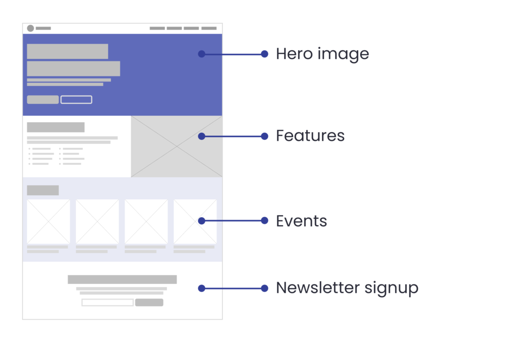
Prior to creating the concept designs, I came up with four standard page sections (see image above) that would be used across the two designs with some realistic example copy. This section consistency allowed the clients to directly compare the two designs. The usage of example text also helped them focus on the UI patterns as they would then be able to better envisage what kind of copy would go into each section without it being distracting, unlike if Lorem Ipsum had been used.
Bootstrap grid
After a discussion with the developer, I decided to use the bootstrap 12 column grid basis for my designs. This would give me the flexibility to create elements that would span the width of the page by either thirds or fourths thus creating more visual variety in the design. All the while, the design would adhere to a popular framework that the developer would be familiar with. This means that the developer would also be able to visualise how to code the design easily assess development effort.
Accessibility
Each design was assessed to see if it met WCAG 2.0 standards for accessibility. For text, the contrast between the text colour and background would be sufficiently legible for someone who has lower eyesight. Similarly, text size and button size would need to be checked to allow for sufficient contrast and legibility.
On to the actual designs! The colours used and logo were provided by the MyOpsNote graphic designer and followed the client’s established brand identity.
The designs
1. Cutting edge
This design used a lighter blue gradient which gives the design a fresher look. Through the usage of ample whitespace, where elements have a lot of plain breathing room around them, it gives the user’s eyes the opportunity to focus on the content easily. This makes the design feel significantly more expensive and high-end while improving readability.
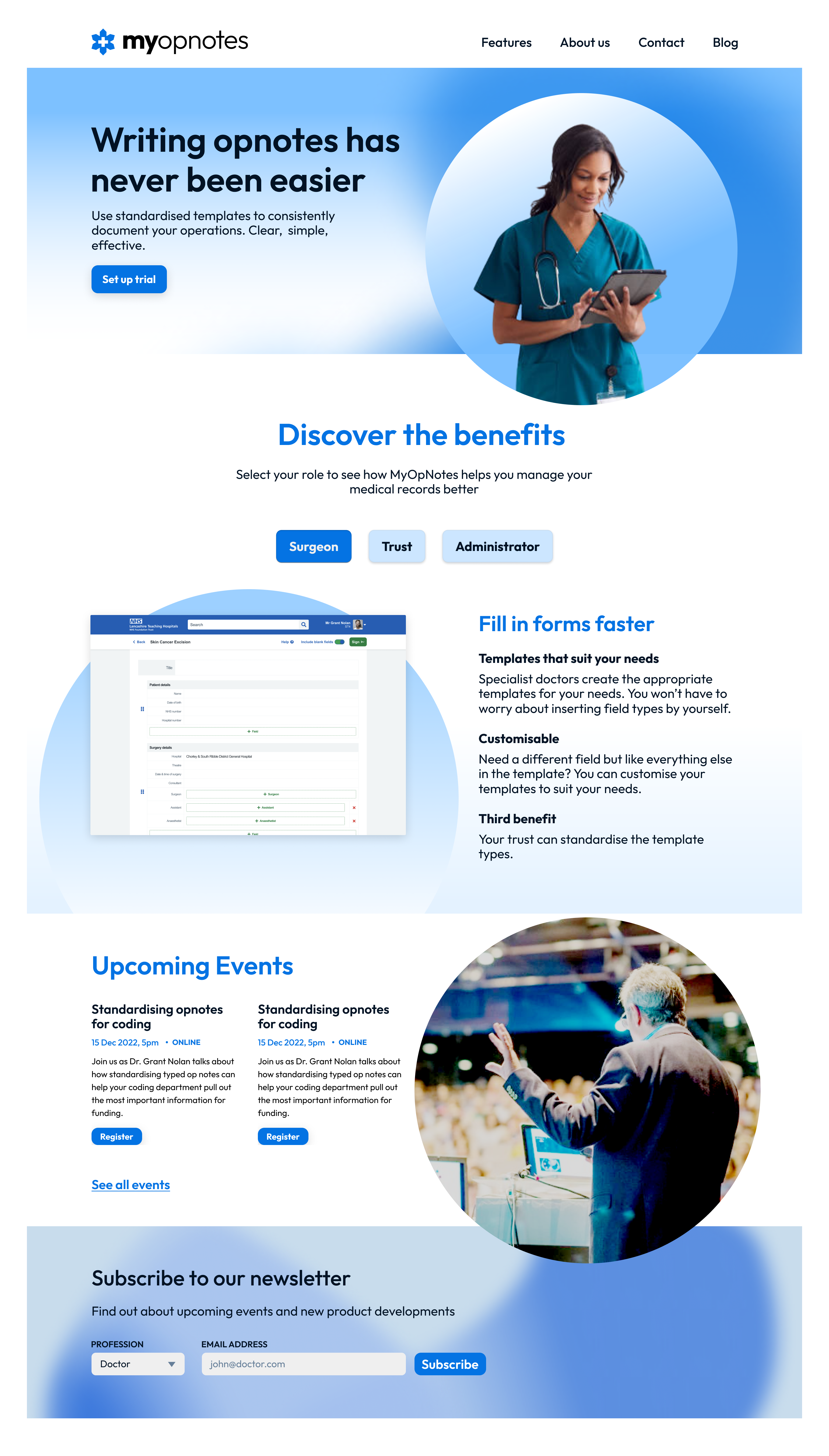
Linear gradients for contrast
In sections, the design uses a vertical linear gradient that contrasts the darkest and lightest portions of the gradient with the reverse in the design elements. This creates an artificial sense of three dimensionality in an otherwise flat design.

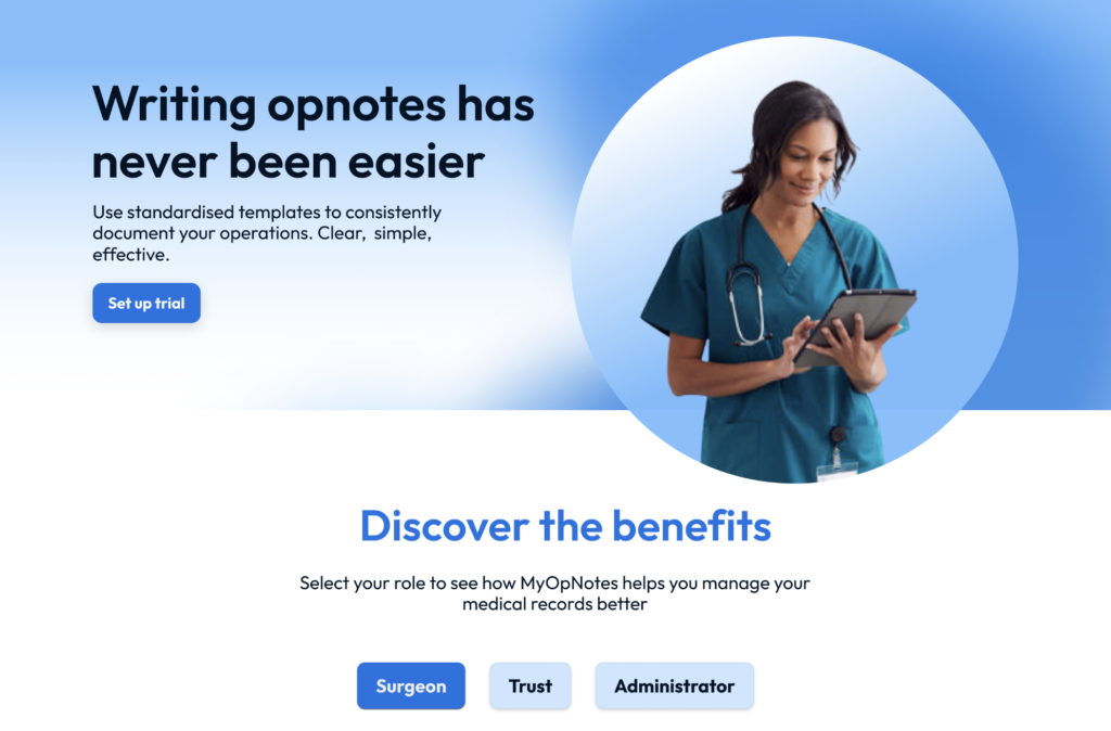
Creating movement
From each horizontal section, there are circular sections that overlap onto the section below. This acts as a visual cue which invite the user’s eye to flow downward to the following section.
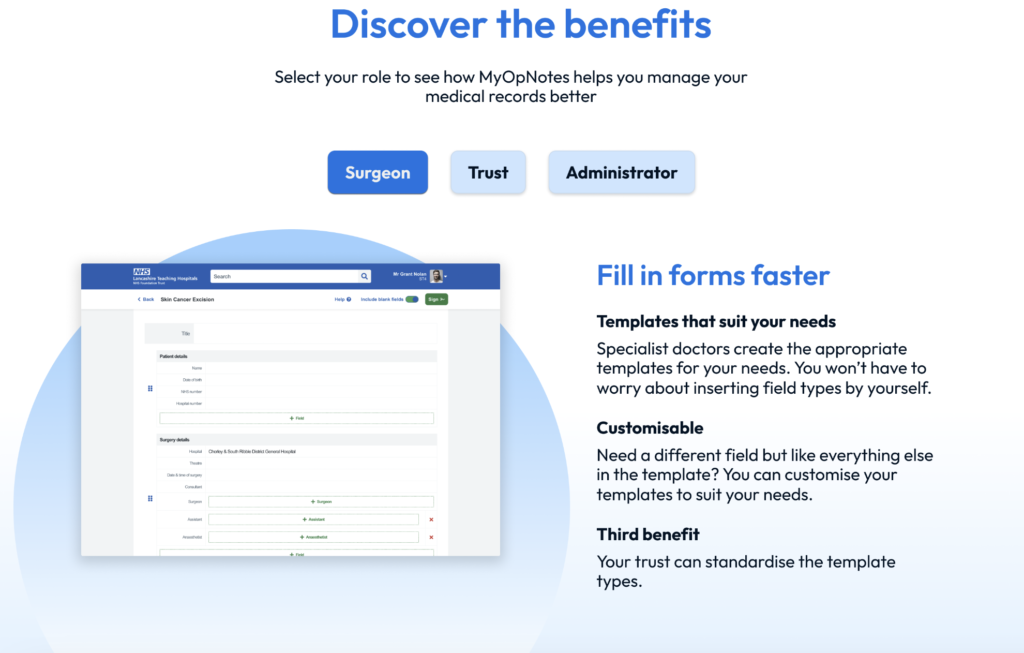
Tabs to highlight value
The feature section used three tabs with different user roles (surgeon, trust, administrator) which, when clicked, would change the content below to show targeted unique selling points that would appeal to that specific user. This would help the client display relevant information to whoever is looking.
2. Authoritative
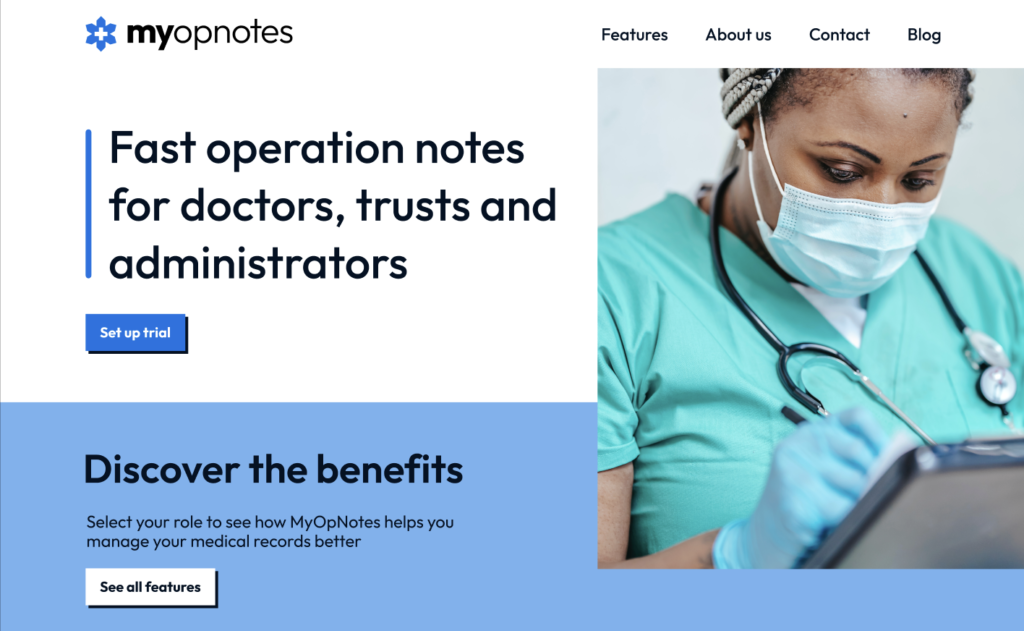
The second design utilised elements that evoked trustworthy institutions. Taking a cue from hospital and banking websites, this design used a darker colour scheme and made use of flatter colours as per the norm for these kinds of institutions to lend a more serious air.

Overlayed rectangular cards
To create movement, the design created downward movement for the eye with overlapping rectangular images. These intentionally looked more severe but also created crisp lines and higher visual impact with an enlarged image that is pushed to the edge of the screen.

Staggered cards
For the events section, each individual card is displayed as a card with a total of 4 cards being shown at any given point. More could be viewed by clicking on the arrow keys to change the set of events in a carousel. By creating these staggered cards, it created a sense of downward movement that guided the eyes to the section below while maintaining visual consistency with the overlayed rectangular images.
Offset rectangles and shadows
The text CTA on the left and the shadow on the button use offset rectangles to play with a sense of depth in a flat design. This created a sense of layering and creating some visual interest without being distracting.

Conclusion
The client ultimately decided to go with a design created by another designer. They were, however, impressed with the cutting edge design as it was clearly visually differentiated from competitors while looking pleasing to the eye.
View other case studies
Skills: UI, UX, Design Thinking
See Alzheimer’s-friendly grocery service >>
Skills: Systems Thinking, Service Design, Design Thinking
